Overview
Roles: Client relations, project lead (and everything else to a degree)
Timeframe: 16 days
Team: 12 UX students
Company: Avertro
Timeframe: 16 days
Team: 12 UX students
Company: Avertro
Brief
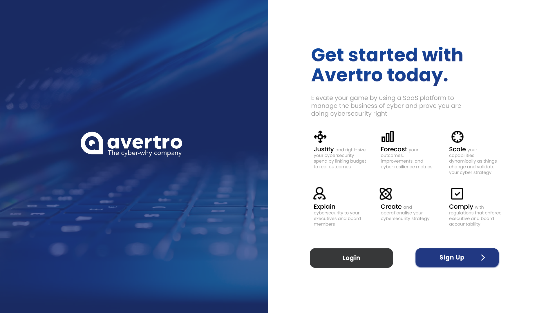
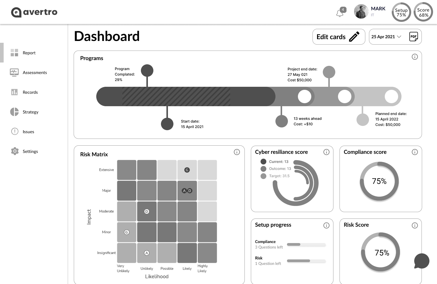
Avertro help businesses to assess and report on their cyber security standing through their software (as a service)
Current platform:
• very complex
• aimed at large businesses
• onboarding can take up to 6 months
• very complex
• aimed at large businesses
• onboarding can take up to 6 months
New platform requirements:
• lighter version
• for smaller businesses
• easier onboarding
• lighter version
• for smaller businesses
• easier onboarding
Method
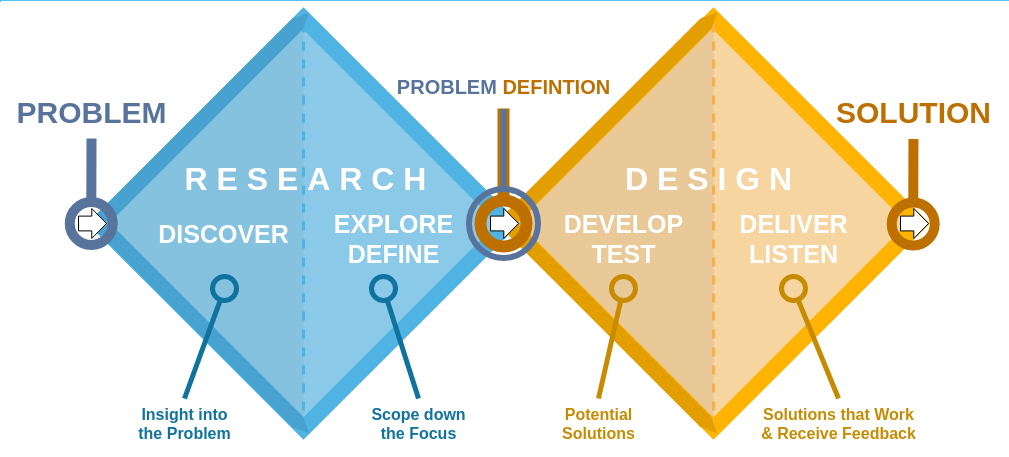
Double diamond: Research > Synthesise > Design > Test/Iterate
Research
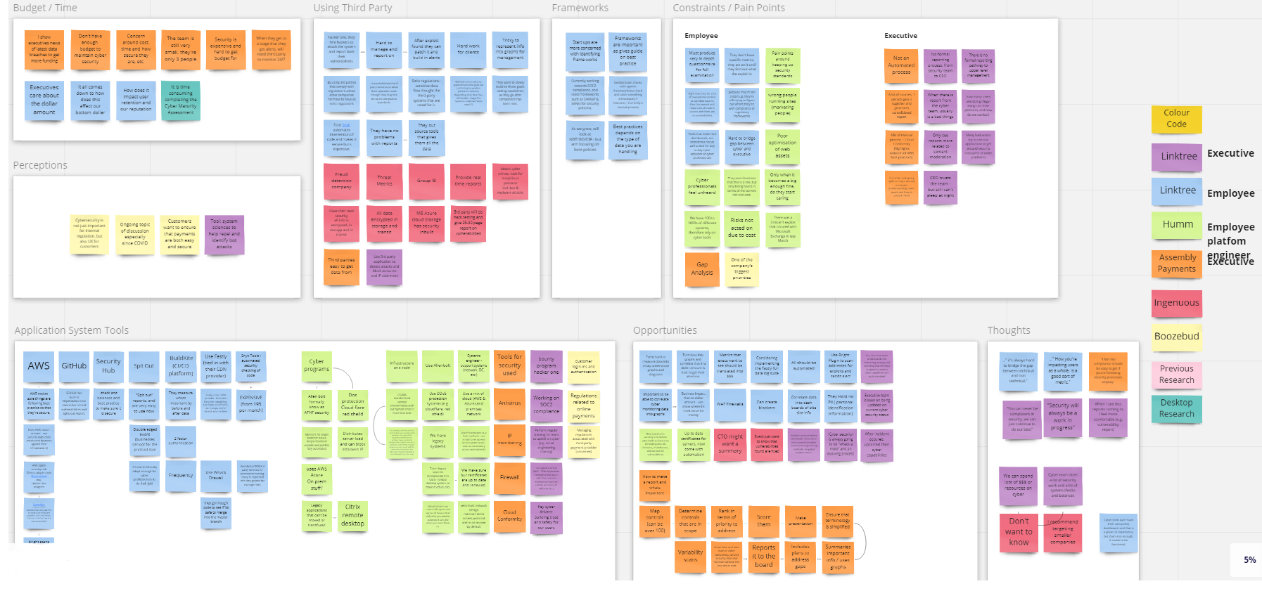
First we learned about cyber security through desktop research and Avertro explained their platform to us. Also conducted competitor analysis
Worked out WHAT to ask WHO and began hunting down leads for interviews
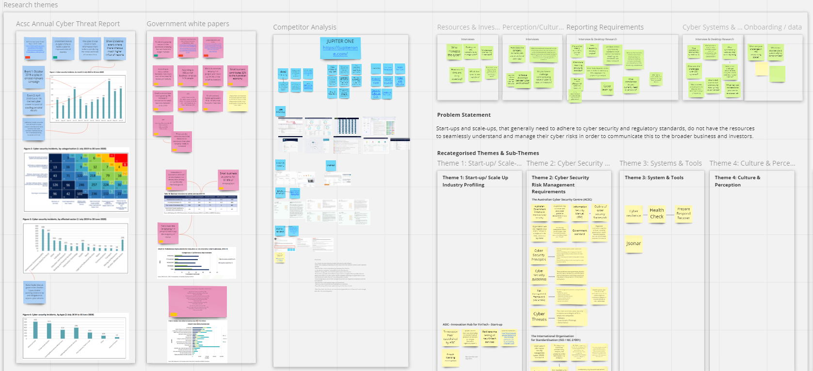
5 Interviewees
Key insights:
• There is a disconnect between Cyber staff and Execs
• It can be difficult getting funding for cyber security
• When Execs see less reports they feel more comfortable
• Hard to display all the data nicely such as from hack testing
• Simply following iso27001 (compliance) is how most operate
• There is a disconnect between Cyber staff and Execs
• It can be difficult getting funding for cyber security
• When Execs see less reports they feel more comfortable
• Hard to display all the data nicely such as from hack testing
• Simply following iso27001 (compliance) is how most operate
Ideation
Synthesised the data and made artefacts such as personas and ran an ideation workshop with Avertro to come up with these high value, easy to execute ideas


Design
Split up and made wireframes that included these ideas before merging the best parts of each together
My ideas:
• Integrate help videos, faq's and jargon explaners
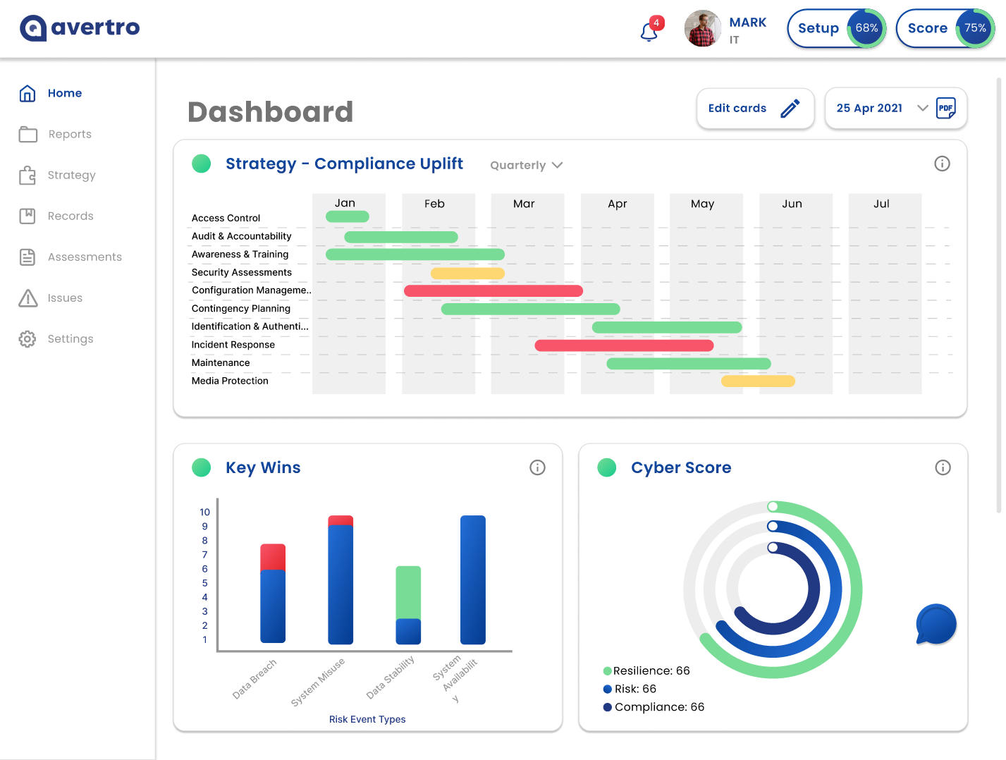
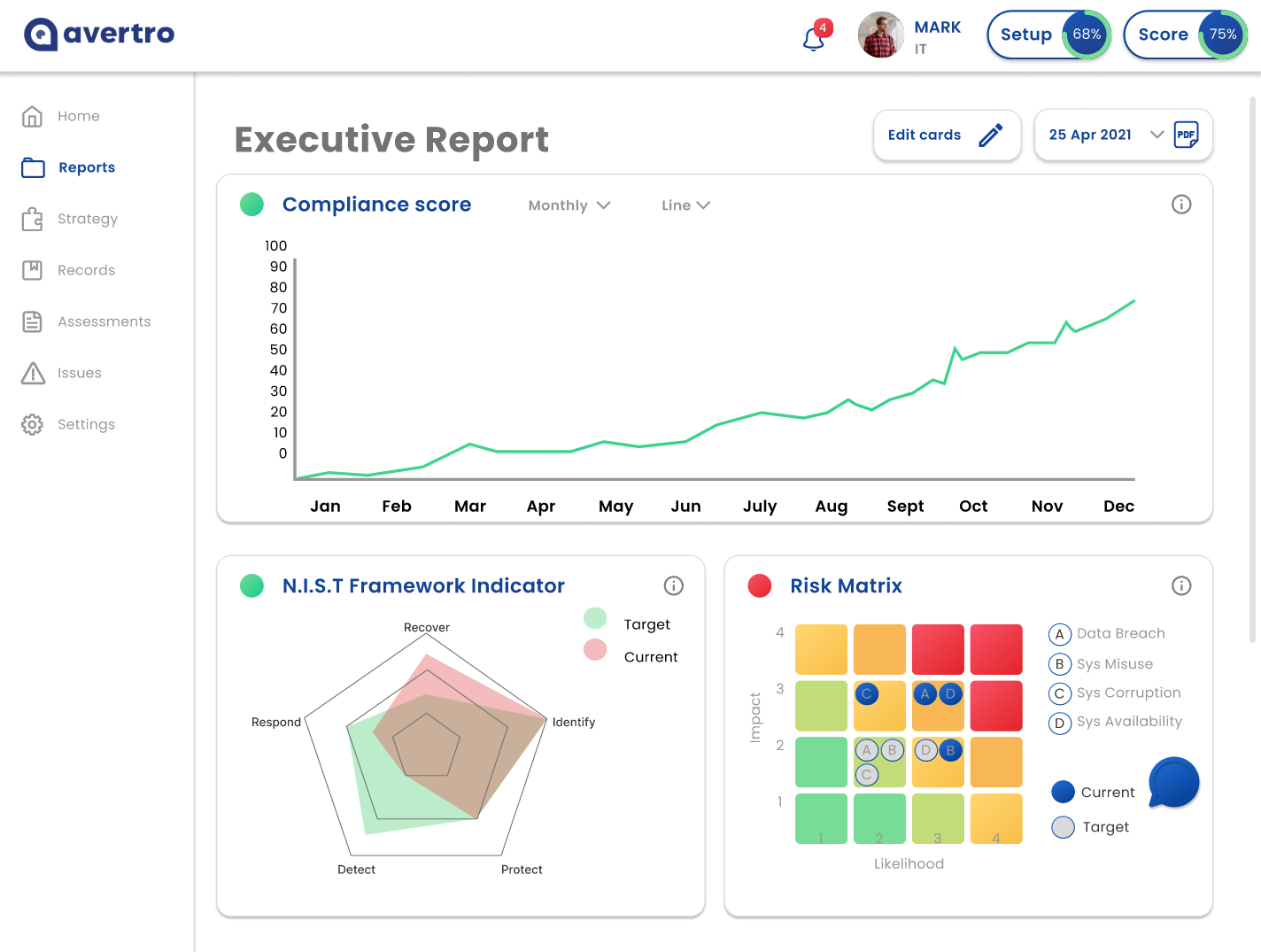
• Add/remove/arrange functionality for the report cards
• % score in header to see security level updating as you make changes
• Integrate help videos, faq's and jargon explaners
• Add/remove/arrange functionality for the report cards
• % score in header to see security level updating as you make changes
Lo-Fi Prototype
Made a lo-fi prototype and tested with 5 people similar to the persona
Comments were made such as confusing wording, layout and functions
Colours
As well as making the required changes, we added colour and moved to hi-fi
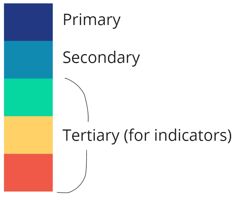
How I chose the colours:
• Found a popular palette online that uses dark blue
• Liked how it has 2 different blues plus indicator colours
• Also like the double split complementary colour harmony
• Shifted hues together so the dark blue matches the brand colour
• Kept initial red (instead of pink) and initial 2nd blue as it had more contrast
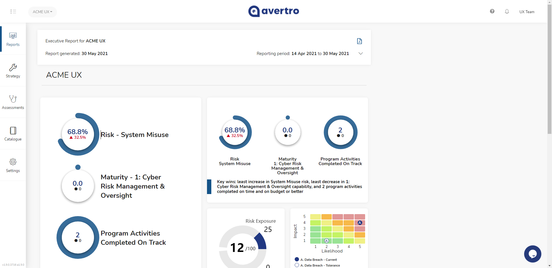
Hi-Fi Prototype
Tested with 3 more users who liked the ability to customise the report cards
Also found the cards needed refining in terms of size and content
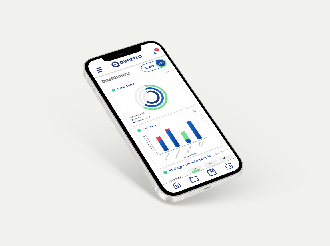
Final version
With all new changes in place, here is the final prototype


Next time I'd like to
• Pay for more relevant users' time to interview and test with
• Consider how to help businesses with no cyber team
• Focus more on the "lite" aspect, researching the key features users need
• Understand the onboarding more in order to simplify it further
• Refine each card in the reports based on user needs
• Consider how to help businesses with no cyber team
• Focus more on the "lite" aspect, researching the key features users need
• Understand the onboarding more in order to simplify it further
• Refine each card in the reports based on user needs